Customers may not realize it, but every step they take along the shelves influences what ends up in their basket.
In a small supermarket, every square meter matters more than in a hypermarket. There is no wasted space here — only space used correctly or incorrectly.
The difference between a store where a customer buys only bread and one where they leave with two full bags is not the assortment.
It is the way the store guides them.
1. The Entrance — where the customer decides to stay or leave
When someone walks into a store, they don’t immediately start searching for products.
First, they form an impression. Within seconds, subconsciously, the brain decides: “worth exploring” or “I’ll leave quickly.”
A crowded entrance communicates urgency and chaos. An open entrance communicates control.
And people buy more easily in places where they feel order.
The entrance should not be treated as maximum selling space, but as visual adaptation space.
If customers must avoid stacked boxes, mixed promotions and overlapping labels, their attention is already exhausted before shopping begins.
Only after they feel comfortable will they start noticing products.
What should exist here:
-
maximum visibility
-
open space
-
clear signage
-
general-interest products
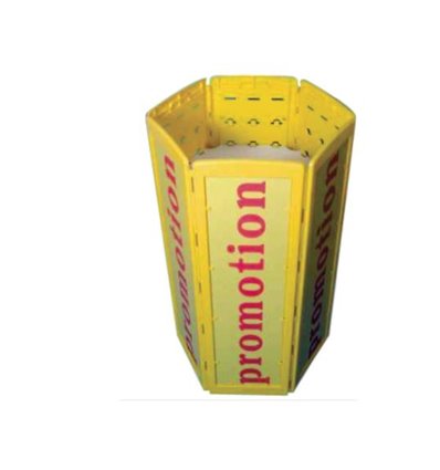
Practical solutions:
-
entrance promotional stands
-
promotion baskets or pallet boxes
-
visible suspended signage
2. The Hot Zone — the customer’s natural route
Most people do not consciously choose their path.
They enter and instinctively turn right. This behavior is consistently observed in retail.
This becomes the most valuable area of the store — not because it is larger, but because here the customer is still curious.
They haven’t picked essential items yet and are not rushing to checkout — they are open to discovery.
If they find ordinary or poorly organized products here, shopping energy drops immediately.
If they find clear, visible, easy-to-choose products, they begin adding items spontaneously.
A shelf should not look full. It should look readable.
Suitable products:
-
snacks
-
sweets
-
single beverages
-
impulse items
Useful solutions:
-
shelf dividers
-
pushers
-
duplex display systems
Customers don’t buy more because they want more — they buy more because they see easily.
3. The Main Shelves — where the receipt is built
Many retailers treat shelves as visible storage.
But for customers, shelves are a decision interface.
When they stop in front of them, they don’t want to analyze — they want to choose quickly and correctly.
If they must search for the price, turn products around, or compare messy placements, they become tired and reduce purchases.
A good shelf is not the fullest one — it is the simplest-looking one.
A confident customer buys more than an uncertain one.
A properly organized shelf must:
-
be readable from 2 meters
-
allow selection within 3 seconds
-
visually suggest the category
Essential tools:
-
clear price rails
-
dividers
-
acrylic fronts
-
pusher systems
Confusion silently reduces sales.
4. End Caps — the place of fast decisions
An end cap is not an extension of the shelf.
It is a three-dimensional advertisement.
Customers do not compare it with the rest of the aisle — they perceive it as a message.
That is why too many products or messages cancel its effect.
An efficient end cap tells a single story: “this deserves your attention now.”
Recommended equipment:
-
wobblers
-
promotional frames
-
flags
-
vertical signage
A good promotion is not the biggest discount — it is the first noticed one.
5. The Cold Zone — traffic-driving products
Milk, water or bread should not be easy to grab — they should be easy to find after a route.
These products are the reason for the visit, not the profit.
They must make the customer cross the store, not leave immediately.
On the way, real shopping happens.
Helpful elements:
-
strategically positioned refrigeration furniture
-
clear category separation
-
unobstructed paths
Customers come for essentials and buy optional items.
6. The Checkout Area — the spontaneous decision moment
After finishing the mental shopping list, the customer shifts from necessity to impulse.
This is where small extra purchases appear.
The checkout zone should not feel crowded — it should feel inviting.
Suitable products:
-
small sweets
-
accessories
-
batteries
-
compact items
The last 30 seconds can increase the receipt by 10–20%.
Conclusion
A store is not only a space with shelves — it is an experience that begins before the product is touched.
Customers do not analyze layout plans, traffic angles or walking routes — yet they react to them at every step.
A well-designed flow is not noticeable through spectacle, but through naturalness. People move easily, find what they need quickly and, without realizing it, discover items they never planned to buy. When the route is correct, shopping feels simple and the basket grows effortlessly.
A small supermarket does not need more space to sell more.
It needs every meter to tell a clear story: where you go, what you see and why one more product deserves to enter the basket.
Because, in the end, the sale does not happen at the checkout — it happens along the way.